Do you know the rule of three?


Three  is a very popular number in many aspects of life from religion to fairy tales, and it is extremely  popular and important  in all aspects of  design .  When you understand how to use the rule of three you have a powerful agent for design change in your home.  Often improvements are free because you simply have to move around what you already have.
 
 In design, using threes helps you build interest and drama, as well as  harmony, and it a very effective way to create visual movement in a room . Three works for function e.g., kitchen work triangle, furniture arrangement, sofa and two chairs.  It also is frequently used for colour and fabric schemes and groupings of accessories and vignettes.  Three can effectively establish a focal point. Here's how you can liven up your space and help improve function.


This is a wonderful graphic produced by Adi Edlin that shows the rule of 3 working twice in a vignette. First in the grouping of accessories in sections and then in the overall design of the vignette.  


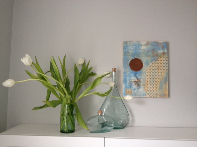
A simpler version  of the rule of three where you have three bottles mixed with three other objects (2 bunches of flowers and a shell ). 


Art collections always look great in groupings of 3.  This one is perfect because it totally fits the wall space and is in keeping with the graphic nature of the colour scheme. I also love the visual relief the circle provides for all the straight lines.  Circles in a grouping also move the eye effortlessly. They are great pivots.

 VT Interiors

This dramatic space  is further enhanced by the inclusion of the three arched mirrors which provide a focal point ( not an easy task in this space).  Relief from the straight lines in the rest of the room is also provided by the curves. 

Do you see three in this arrangement?  Often you get  furniture with very distinct divisions as in this settee.  Because it visually reads as two with the centre legs it provides the perfect foil for this artwork.
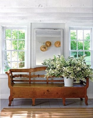

Look carefully at this vignette  because it is masterfully put together in variety and scale . First we have two windows and a mirror mimicking the windows for a total of 3, then there are three hats visible in the mirror and three objects in the vignette (bench, floral arrangement and mirror). The scale of the bench is perfect for the width of the 3 "windows' behind it and the flower arrangement works so well with the weighty bench.


Lots of threes here: colour scheme of yellow, blue and gray; vignette of art, chair and table; and three shelves and three groupings of objects on each shelf.  There are also at least three yellow and blue objects spread throughout the vignette to move the colours around.

Perhaps you can look around your home and see places where the rule of three can be put to use  to refine  how you have arranged things. Don't overdo it ! Remember that any odd number is effective.  I particularly love five mixed with three. Have fun.....

The Tardy Decorator

I can't believe I haven't written a  blog post since May.    I am posting regularly on my Facebook page which is quick and can  be accessed easily as I travel and relax  at my summer home. I don't think I am the only one who falls shy of projected output over the summer months. 

I am also tardy in completing my own home improvement projects. I wrote about my main bath reno last year in this post .  I made all the design decisions and purchased materials.  Now they all lie in my painting studio and have been beckoning for a year.  I joked with my husband, who is the contractor, that the choices will be past their prime by the time the room is completed. I'm already having second thoughts about the sink I purchased.  The new  completion date is fall 2013.  He won't commit to a specific month though! 

I am also re-decorating my guest room which has had nothing done to it in 15 years! It is a deadly beige right now and I've moved my black shaker bedroom set  into the space  and plan to work with a black and white design and possibly one or two  colour accents.    Here are some inspiration pics.

Tom Stringer Design Partners

I love the mix of organic and geometric patterning.  I already purchased narrow striped black and soft white sheets and have my eye on a duvet. I am not a lover of dark window treatments, but this room looks great with the geometric cut on the black roller shades.  There's  nothing like a tidy window treatment. BM Acadia white OC 38 is my choice for wall colour.  Stark white is too clinical for me. 


 Pinterest

I've seen this picture many times on Pinterest and I still love it.  It gives an idea of how fresh black and white looks with an accent colour. 

It is so easy to dream up the schemes, but when you do all the work yourself it usually takes awhile to get into the groove.  Right now my garden is taking priority.  I hope the guest room doesn't take as long as the bathroom!

Accenting with wood

  There are so many ways you can make your space inviting .  My recommendation today is to  consider wood because it can add both warmth and architectural interest to any space.  Choose a little or a lot, there's something for every space. If you don't  like the warm tones of wood but love the grain and texture, think about white washing or gray washing it.   How about using  wood  in......

Accessories 


A few twigs or pinecones as part of a table display or sliced wood attached to board or a recessed box shape can add instant interest to small areas.

These houses cut from weathered 2 x 4 are the essence of simple, but when massed together they provide big impact  when displayed on simple white vertical  shelving  attached to white painted board. 

 source 

If you find beautiful wooden boxes like the ones above grab them.  They not only provide extra storage but they look great in any application.  You can tuck them away or use them out in the open as an end table in a living room or as a night table in a bedroom.  They are so versatile. 


Room Dividers 

 I am not overly fond of room dividers, but some are so well done they look like an art installation rather than a functional aspect of a home. Here are some of my favourite ones.....


source

This  divider is attached to the ceiling and floor with rods but it appears to  float.  It also allows the homeowner to place a piece of furniture in front of it.   I think I would like to see the buffet a different colour so it stands out from the wood, but there are just as many arguments for having it the same colour.

 
 source 

I just love this divider because you can move around it on both sides and it is so substantial looking and works well with the flooring.  

source

 This is perfect in every way, but the addition of a concrete sphere against all those horizontal and verticals is inspired. 

 Bathrooms  

All of these bathrooms have a mix of wood and other surfaces.  Each provides relief for the other and in this way work together to create a stronger aesthetic statement.

source 

 There is just enough wood spread around this room to create a wonderful balance with the abundance of marble. 


This is both an accent wall and an integrated storage space.

source 

Sliding doors and drawer and open shelving.  This space has it all.

Isn't the asymmetrical placement of this wood strip just a prefect balance for all the white and glass on the left of it?

Fireplaces
source 

 Rough hewn logs in an asymmetrical placement work really well .  Chunky and demanding they make quite a statement.

While this is probably rough wood that is stained, it looks like charred wood.  It is this quality that is so appealing in this application.


I guess you are getting the message that I love asymmetry.  This delicate shelf that extends beyond the fireplace on one side is the perfect resting place for two white vases that reference the colour of the fireplace surround.

Accent Walls  

And don't forget the power of wood for an accent wall.  Either natural or stained, you can't beat the  warmth of real wood.  I especially love it paired with white walls and furniture.


A little spring in my home

Do you like white flowers?  I'm a sucker for them.  Nothing is as fresh and inviting as white and let's face it, there's nothing white doesn't match.  Lucky for me there are so many varieties of white flowers that  I can keep finding something  year round.  A large bunch can be divided into two vases if you keep your vases on the smallish side.

 Here's my latest  addition in the laundry room.  Don't be afraid to mix up your vignette for a bit of newness.


Which of these  vignettes do you like the best?

Margaret Ryall

A modified L line of design...

Margaret Ryall

 the classic check mark / V or...

Margaret Ryall

the always predictable A arrangement?

Sure do wish this art work was a little bigger!  It is one of my mixed media pieces ( 11 x 14 in.)  titled Attempting Balance (encaustic, paper, and metal on cradled panel) created at the 6th International Encaustic Conference in 2012 at Provincetown, NJ.   My laundry room is a lovely art gallery.  I have to make it nice because it is open to the hallway and a walk through for the powder room.  

I don't only rotate the objects in my arrangement I also rotate the art hanging there.  If I want to live with a piece to determine if it is finished I hang it in the laundry room!

6 Options for painting trim


  There are so many decisions to make when you begin decorating a new home or renovating. Something as basic as what colour to paint the trim often causes homeowners hours of deliberation.  How about you?  What decision have you made about painting your trim work?


1.  White/off white

This is  the most common solution to painting trim .  It works with every style and is fresh and crisp. 


Even if you have white walls your trim can also be white. Consider changing the paint sheen to semi gloss or gloss if you want to accentuate the trim in a white room.        

2. Wood - natural  or stained 

There was a period of time when many homes had natural or stained wood trim, but this trend has slipped a little in the last ten years.  When you have wood your decision is often to leave it natural or stain it.  When your floors are also wood, it can help you decide which stain option to go with.

 Contrary to popular belief wood trim is not sacred.  If you want to paint it don't hold back.  Interestingly enough it is mostly men who revere wood. When you choose this application your are making a decision to outline a room.  Make sure this is what you want to accomplish.


 Rebekah Zaveloff

 In this space the trim colour is in keeping with the floor tones and is just a little darker.  

Houzz

With light wood floors you always have the option to choose your trim stain  to work  with your furniture. I think the omission of crown in this space really works well to provide a lofty look and keep the viewer's eye at living level.


Your wood trim  doesn't have to be dark to be effective.  You often see natural wood trim  in more modern spaces  where the walls are usually a  light colour  Hint. If you want to achieve a lofty look as in the previous room shown, paint your crown the same colour as the wall.

3.  Same colour  as walls
I often use this application in modern spaces or in rooms where there are too many doors.  When you do this a seamless look is created and the walls become the perfect place to display art without  all those lines you get with alternate colour trim. If you have a more traditionally styled home and modern furniture,  painting your trim the same as your walls will provide an updated look. 


Wondering about chair railing or other paneled effects ?  Rather than removing it, paint it the same as the wall.


4. Colours 

If you are someone who loves colour, this might be the look for you.  It also works well in kids' rooms.    Beware this application creates strong outlines in a room and can chop up your space. Some would say it adds energy because your eyes are always wandering.

5. Darker Than the Walls

This is a good solution in certain spaces. When you paint your trim darker, choose a colour that is roughly two values darker than the walls. This is a great treatment for modern spaces or commercial spaces.


6. Black
This is a daring solution for trim.  When used with white/off white  walls it provides a crisp look that is elegant and serious.  Black looks equally good with soft gray walls.

 Architect Neuhaus Design Architecture, P.C.

If you have very ornate trim , black can really accentuate this sculptural element in your home. Don't be afraid to use it. 


Lots of options....


Decor refresh for spring

New growth always brings with it hope and energy for life.  Once the snow goes I always get a hankering to make changes inside my home.  Now don't get me wrong, these aren't major changes.  I'm more into ten minute additions.  Sometimes I'm willing to commit an hour or two to a special project.
If you get the spring  hankerings perhaps there's inspiration in these ideas.

Use a tray to organize a vignette


Perhaps you have a blaw wooden tray you could spray paint and then organize a colourful spring vignette in it.  Think about what you might already have to add and then buy several filler items.


 A small tray on a bathroom counter adds a fresh look.  Placing a grouping of cut  flowers always adds to any vignette.


I particularly love groupings of white and muted colours and then a big splash of colour with cut flowers.  Yes,  my biases are showing.  Fresh flowers rule in my life. 

 Plant spring bulbs


Tall glass vases allow you to see the roots growing .  You have to be on top of the watering if you are going to adopt this idea. Repetition of the same shape always looks good in an arrangement.


This simple twig wreath adds  additional detail and texture and also helps to cover the pot the bulbs are set in.

Paint something

 You don't have to repaint a whole room.  There are so many simple painting projects for your home.  If you have a bed perfectly centred on a wall, consider adding a painted headboard all the way to the ceiling.  Simple and very eye catching.


 Bring a simple bookcase to life by repainting the back of it.  A fresh colour like this yellow (which is a hot 2013 spring colour) adds a simple focal point and shows up the grouping of objects and books .


 I love highlighting a porch or entry  door with paint.  You can be brave in your colour choice when you want to add a cheery accent to a small space.


 Coloured islands with light cabinets are everywhere lately.   This is such a fresh look if you have enough nerve to go there.


 Not artistic?  Don't worry.  Choose sculptural artificial flowers and lay them on a canvas painted in a solid colour.  Trace around the shapes with a white coloured pencil .  Fill in the shapes with white paint.  Presto!  Fresh art for your wall.  The simplicity and off center composition of this work makes it. 


Consider textured wallpaper


 Textured wallpaper is underutilized.  There are so many patters and textures that cover the gamut from very traditional to modern.  No doubt there's something for you.  I like the use of textures to reinforce a dresser make over. This is a great idea for a little girl's room.


Check out these links and more ideas on  my Pinterest Spring Refresh board.