Are you feeling blue?

Hopefully you are into blue!  Blue seems to be a dominant colour in Pantone's colour forceasting for  both spring 2013 and upcoming 2014. Here's how it's playing out....

 Monaco Blue (Spring 2013)

 Dazzling Blue (Spring 2014)

Two blues, but with great differences.  I can't say blue is a big favourite of mine, but I am really into Monaco blue because it is a warmer blue that is approaching navy. I don't think it is a blue that you would  catagorize as trendy. Perhaps timeless would be a better descriptor.   Dazzling Blue seems to be a colour that will not be  around for the long haul.  It is cold, quite exciting ,and lends itself well to accessorizing.   It isn't exactly a colour you snooze to.  Could you have it on a wall?  Not me, but there are those who would.  

You could use it a little or go whole hog and saturate your space with it. 

 Welcome to the world of dazzling blue....


 .... put it on the outside


on furniture or pillows...

 I really like it mixed with various grays and all that texture.  Both serve to tame it down a little.  You will notice quite a bit of colour variation in the blues above. Mixing a more vibrant dazzling blue in with "tamer" blues seems to be a good solution if you aren't into bright. 


on a wall....

 Whenever I see these fresh, intense blues my mind goes to warm countries like Greece.  Since I don't live in one, it could explain why I am having trouble warming up to this selection.


or a poof...

This is a truly dazzling accent piece that could find a home in most decors.


 in glass or flowers...

and tile ...


on chairs ...

 or bowls...


 or a pillow with lots of other fun colours. 


And here it is with Celosia orange another Pantone selection for spring 2014.


These colours  show up on the runway too! 


Which type of blue decorator are you?


The big cover up

No it's  not a scandal!  Nothing juicy really.  I got to thinking about the artful display of throws when I came downstairs this morning to find this jumble left from the night before. 


I am interested in comfort and function as well as style.  While this throw gets used almost daily it  also adds to the overall feel of our family room.  In terms of design, the main attraction when I  first saw it at Costco  was its texture and muted colour;  I knew  it would sit nicely on my family room sofa and not disrupt the pattern play of the two pillows.

accessories throws   Designing Home
 Margaret Ryall

Here is where it first lived when I brought it home.  After several new furniture purchases the chair has moved to another room and the throw and pillow are now on the sofa. As you can see, it still serves the same design purpose  as on the chair by adding texture. Apart from function, here are some of the reasons a throw might be a good purchase for your living room:


Use a throw to add texture to a space.


This throw has two elements for the price of one.... lots of pattern too.


The ultimate texture ... fur real or fake.


In this perfectly neutral scheme the throw adds very subtle texture.


Use a throw to solve a design dilemma

 Margaret Ryall

This Turkish throw helps integrate the railing between my living and dining room  into the colour flow without having the orange undertone in the stain as an accent colour.  It also serves to break up the expanse of rail. .


If these lovely navy and white throws were not on these chairs they would totally disappear into the wall. They also serve to add a third pattern into the scheme.

Use a throw to add an accent colour


This is an interesting arrangement of throws in a chair.  I would rather not see the fringes, but the layering is subtle and lovely. Love the yellow and gray.


It seems  yellow is a very popular colour accent! The National Geographic magazines under each table are an interesting touch given the area rug looks like written text.


This room has a lovely colour flow and the folded throw moves the green to the two ottomans. 


 Use a throw to add pattern


 I have throw envy with this one.  Love the bold geometric pattern, and I quite like a throw over the arm of a chair. Notice the other one on the lounge section.  Lots of texture.  Two seems excessive to me, but probably there are two homeowners who like to cover up.

 Stephanie Wiley Photography

Although the pattern is very subtle on these chairs, it does add to the room.  I think I would have added it in the pillows, but that's just me. 


The making of an interior decorator

  What's your interior design aesthetic?
             "
"What's that you ask?  Design aesthetic?
Should I have one ?  Perhaps I do! " 

This is not a question I could have answered in my teenage years, but it was those early years that laid the foundation for what I would come to understand and appreciate about design in my adult life.

 I believe our  interior design aesthetic (aspects of interior environments we are attracted to) is developed from what we've been exposed to  through our life experiences:  the house we grew up in,  homes of friends, your home town, reading, travel, and various forms of  media, etc. 

 The road to my house just before my birth

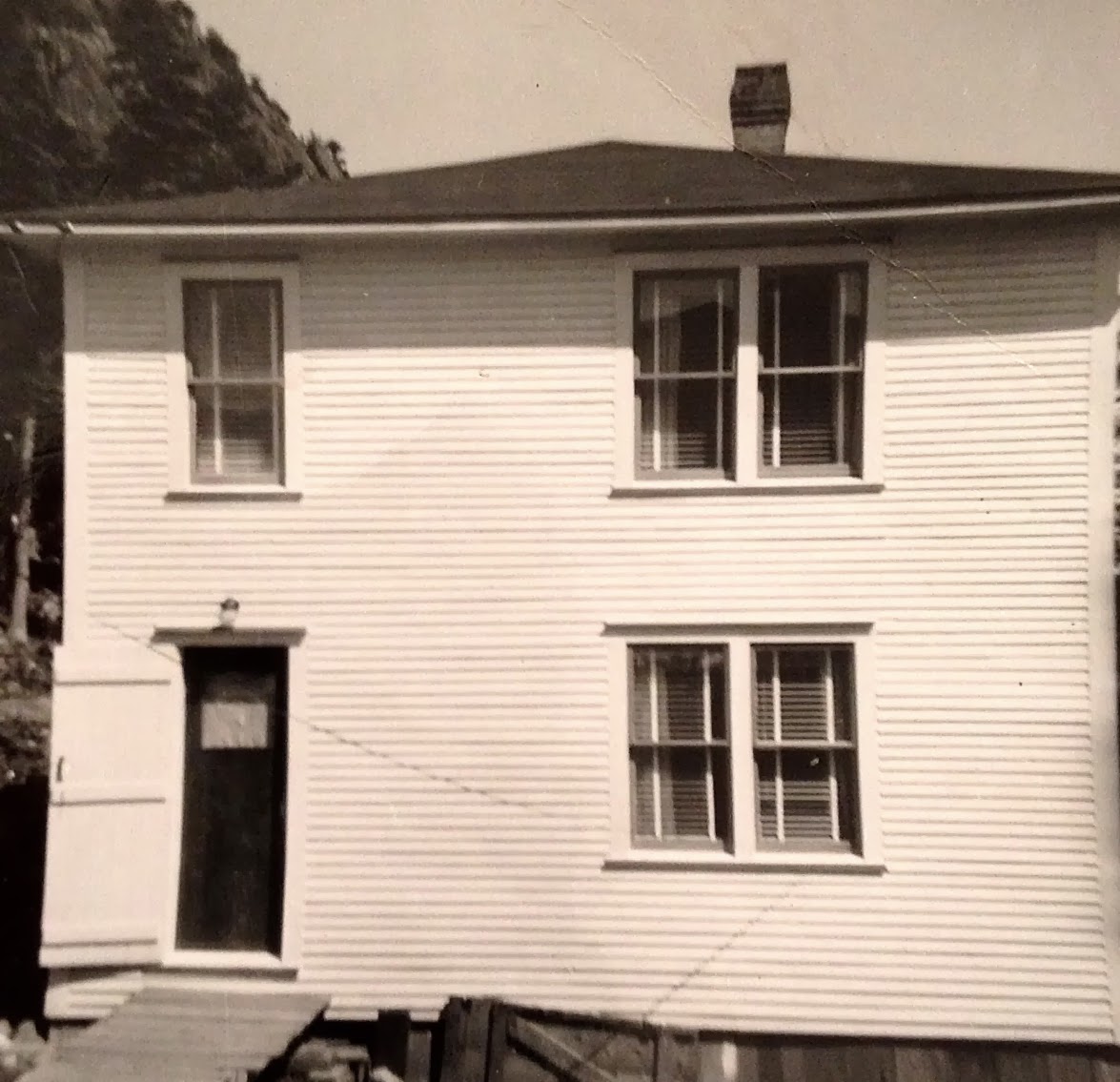
My house age 8

 Is this a town that raises a design conscious gal? 

"Yep!" 
 How did that happen?

I was exposed to very functional decor growing up in a small town in Newfoundland in the the  50's and 60's, but there were always  handcrafted  items in our home and I was encouraged to participate in their creation. There always seemed to be lots of scraps of wool, fabric and thread around.  I  appreciated what an individual could create with very modest materials, and I  believed at an early age that I could create anything I wanted.  That's a pretty powerful beginning.

The Singer sewing machine got lots of use in our home. It was a sound I did homework to, read to and even made it hum myself. 

What came off it was varied: curtains, quilts, bedspreads, and even mini skirts and tent dresses. Fabric remnants came from family members in New York.  That link assured I was current in textile designs! When not sewing I was busy with  crocheting , knitting , and hooking  rugs. All added warmth to our home.


At 13 I discovered the library in the next community and my design world expanded. 


Good Housekeeping

 There were books and magazines  that took me well beyond the small town I grew up in.  I devoured them, imagined, sketched, and rearranged our bedroom (with my sister's help) numerous times.  Mom took it all in stride. 


 Quite the design statement!  I had nothing to do with this decor, but I did make the dress! Not bad for a 15 year old.  At the time, I thought I would be a fashion designer, but good old Newfoundland practicality took over. 


TV programming added to my understanding of what was in style. I jet setted around the world with The Man (Men) from Uncle without ever leaving my living room. 

 And got my first taste of that famous British style on the Avengers. 

What we now refer to as Mid Century Modern design was in its prime in my formative years.  For the youngun' reading this think  Mad Men. 


When I was 19 I spent the summer in New York. It was a trip of firsts.  First time I went to large department stores,  first time to see art galleries,  first play.....   And what about what I saw on the streets and in store windows?  It all went in and somehow came together into a feeling, a sense of what I liked and wanted in future interiors.While this type of decorating was happening in New York....


Albert Hadley, New York, 1971

The average homeowner was living in this.

That was a pivotal time in my understanding of the broader world and the vast discrepancies among the homes I was used to and the homes of the "out of reach". I began to read more and think about what elements and principles interested me  in the designed interiors I was viewing on TV and reading about. My design aesthetic was forming.  

In 1973 I got my first apartment and  it had a lively colour scheme of white with red and navy accents.  All very fresh and simple.   All second hand and dressed up with lots of covers and paint.   I moved from being a university student to a teacher - a different kind of designing! I continued to read about design and do lots of DIY projects. 

It wasn't until the mid 80's that I decided to study interior decorating and it would be another twenty years before I officially advertized as a decorator.  I would contend I was always one. During that time I also began to paint.  It was this activity that honed my colour sense and gave me a firm understanding of the elements and principles of design. 

 My design interests today can be traced back  to my roots as a mid century modern girl.  I still love clean design without too much "fussy".  I like  furniture with straight lines,  geometric motifs especially circles, lots of texture, light colours, hand made items and abstract art.  I describe my look  as casual contemporary with a quiet edge.

What's your design aesthetic?

Design Solutions: A bed between two windows

Work is keeping me quite busy over the last several weeks and blogging always drops off when this happens.  I'm beginning a series of posts called Design Solutions that will  address common design issues that often crop up when I work with clients.This is a great way for me to come to  terms with options and at the same time it provides a written commentary that I can send clients to in the future.  If I can help my readers in any way, it's a bonus.

Being a lover of asymmetrical balance, I can't explain why I am so attracted to the placement of a bed between two windows.  But I am. The windows become part of a larger design tableau in such instances, and the whole wall must be considered as a unit including headboard, night tables, lamps, table vignettes, art, window treatments and bedding.   Here are several guiding principles to keep in mind.

 Keep it symmetrical


When you start with a layout that is symmetrical, it works best to continue using this form of balance in your design .


Consider  your headboard shape when choosing art

  No headboard

 The height  and shape of your headboard will dictate what you place over it .  When you have no headboard you have to choose something that will fill the space well, and circular shapes with lots of texture and warmth are brilliant.

High headboard

The pillows act as  the center of interest in this layout of high headboard framed by draperies.  No art is needed.


Many designers are attracted to  groupings of three objects (art) between two windows.  This is an option, but not one I usually advocate.  When there are too many rectangles my eye craves  something curved or solid. In this room  the art reaches the top of the windows filling the space in between thus making the windows, headboard, and art one large rectangle. 

Low headboard
Design Solutions: A bed between two windows

This is a beautifully designed space, both elegant and simple at the same time.   The headboard  is low and the six art works fill the space nicely.  It is always interesting how you can depend on one element or principle  of design to  negate problems with another one.  With all the lines in the windows you might expect  that 6 pieces of artwork would be overkill in this space.  Not so here.  The dark frames and lines in the romans make the window lines almost unnoticeable. Contrast always wins when vying  for attention.  The curves in the spectacular roman shades also provide some relief from all the rectangles.  I rarely hang roman shades from the ceiling, but in this case it works especially well.

Curved headboard

It is difficult to hang art over a curved headboard; it is often best to let the curves be the statement.  In this room a spectacular light fixture adds additional visual interest to the larger vignette.


And the exception to the rule... there's always one!  The lamps fill in the curves and the three pieces of art look especially good hung in a straight line.  It doesn't hurt that there is a circle in the headboard. The art is light and the bed becomes the center of interest in the room.


 Follow the lines of your curved headboard to place three pieces of art....


or use a round mirror or sculpture at the top of the curve.


Use window treatments to frame the bed


My preferred solution for a window treatment on matched windows is draperies.  They soften all the hard edges and make great frames for the bed and the night tables. Think about your table colour when choosing your drapes.  The tables should stand out not disappear. Yes, I would change the black, wrought iron rods! Love the simple pillow arrangement and circular mirror.


Consider using blinds behind draperies for privacy. and be adventurous when mixing designs  in the space. I think this combination works well because all the  patterns have the same colours.


Hanging a drape on the outside edge of both windows and using a shade of some sort is another option for a window treatment .  This solution opens up a small room and gives the bed more room to breathe.    The shades are the centre of interest in this room because they are so dark. Patterned fabric adds another element of interest.   I love  round night tables when there are two windows because they serve to soften all the straight lines.

If you want to maximize visual space keep your shades and drapes light and matching. Be careful when you choose rods for your window treatment.  Rods are functional and to my mind they should blend into the decor not make a statement that draws your eye upward. There's nothing else black in this whole room so why choose black rods? Check out a previous post on Choosing Rods.


Romans are simple and linear.  You would never call them soft, but they can frame a bed nicely when they are used in conjunction with tufted or other luxurious materials in a bedroom.  By choosing a simple monochromatic scheme these romans serve to move your eye around the room and allow the white window details to frame the bed.  The white art is a repetition of the the frames. 


 And why not make your window treatment the focal point in the room? Overload on draperies.


My parting comments:  This small  monochromatic space maximizes design in every way. If you want to put three art pieces above the bed it works best when there are soft draperies on either side.  The simple images and large white borders connect with the white bedding and lamps.  The larger white accessories are simple and perfect.   The dark furniture anchors the space and I don't even mind the black rods!

Links to all images can be found on my Pinterest board Bedrooms.