My furniture painting secrets

Do you learn the hard way and wish at the end you had checked things out a little more thoroughly?  This  overconfidence gets me in hot water more times than I would like to admit, but learn I do!  I paint furniture frequently.  That means lots of experience from too many mistakes. Here's my recipe now.

What goes under a paint job is very important especially if you are painting a hard surface like laminate. My best painting tip in these situations is ....

Stix bonding primer
My top pick for a bonding primer

  use STIX bonding primer  as a base on just about anything, and then go with the paint of your choice on top of it - my fav is below.  With used furniture degrease with TSP or vinegar and do a light sanding with a sanding pad or electric sander. Paint doesn't like grease, and I always feel better if I sand a bit first. No need to overdo it!

The Facts on STIX

 Keep in mind:
  1. STIX is not a paint but a  primer/sealant, only a thin translucent coat is required; you are not gaining anything by going for opaque coverage.  
  2. You don't  need two coats; don't waste it because it is on the expensive side.
  3. You probably need a quart rather than a gallon for smaller jobs because it spreads a long way.
  4. It is best  applied going in one direction using light but swift movements. Forget back and forth or w moves.
  5. Wait at least 90 minutes for drying.
My latest project was a colour change for a small media cabinet from Target.  We needed  a multipurpose piece to act as a side table and storage for  two pieces of  TV equipment.  I hate it when you need something right away because you are forced to choose from what is available. 30 inch media cabinets are a thing of the past it seems; everyone has big TVs.   This one was the least offensive to  my design sensibilities.  NO I don't love it at all because it is a tad too traditional for me, but it will serve our purpose until hubby builds one - might be years!

media cabinet Target

The nutmeg colour looked terrible with my decor  especially my so lovely golden undertoned 80's oak. In comes trusty BM Iron Mountain  to match the  family room colour scheme. I highly recommend this gray if you are looking for a dark gray hue.

Benjamin Moore Iron Mountain
Benjamin Moore Iron  Mountain
 
If I want a durable finish I use Benjamin Moore Advance in a pearl finish.

Benjamin Moore Advance waterborne alkyd Iron Mountain

But.... if you are the impatient type it might not be for you.  I have to do a lot of self talk to get me through the drying time, but it is worth it for a durable finish. 

The facts on  Advance

 Benjamin Moore Advance is a waterborn alkyd and is as close to an oil finish as you can get today.

 Pros:
  • durable finish
  •  levels nicely
  • soap and water cleanup
  • available in all BM colours
  • low VOCs
 Cons:
  • difficult paint for impatient people (like me); re-coating time is 16 hours (don't try to hurry it); seems to take even longer when applied over sealed, hard, non porous surfaces; takes many days to fully harden from my experience
  • some reviews report whites yellowing over time ( I haven't used white)
  • higher price range(you get what you pay for)
  • not self-priming, stain-blocking nor antimicrobial -mildew resistant
 If you want a very extensive review of this product read Jack Pauhl.


Advance Benjamin moore Stix bonding primer
Benjamin Moore Iron Mountain using  Advance
 
Photo:  Margaret Ryall

 You may notice we chopped over two inches off the legs to hide the wires that were coming down behind the cabinet.  Wires are the enemy and they must be dealt with at all costs! This will also be used as a side table so it needed to be shorter.  I liked the higher legs, but function always wins. 

Do  you have any painting tips to pass along?  

Blue- A home decor trend to watch


 It seems like only yesterday I  wrote my  2013  home decor trends  post,  and I've already looked at Pantone's Colour of the year, Radiant Orchid, and suggested  ways to integrate this vibrant colour into your decor. What else can we expect in the coming year?

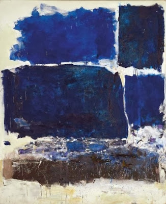
While Radiant Orchid is Pantone's colour of the year, I think it will be the blues that will take over the stage in 2014.  Joan Mitchell had this all figured out in her 1972 painting!  She painted the best blues ever and these are the ones you'll be seeing more of in 2014.

decor trend 2014 blues
Joan Mitchell, “Blue Territory,” 1972


 And here's a modern interpretation of the darker side of blue...

2014 blue trend home decor
A range of blues for 2014


This year the popular blues are much deeper leaning toward cobalt and navy.  But what can you put with so much blue? 


decor trend 2014 blue and yellow
Add yellow as an accent in 2014


decor trends 2014 navy and gold
Gold accents work well  with navy blue and cobalt
And don't forget vibrant oranges or greens with dark blues.  The sky is the limit with this colour.  I thought the art work in the mood board above gives lots of accent choices. 

navy blue cobalt blue 2014 trend Designing Home
Versatile green blue looks great with white and radiant orchid

And never forget that blue has a green side that mixes with all sorts of colours especially the pinkish purples like Radiant Orchid. That way you can bet two trends for the price of one.  Think turquoise, aqua and any blue you may see on a Caribbean holiday.


Benjamin Moore highlighted the lighter side of blue for their 2014 Colour of the year. It is reminiscent of summer breezes blowing lightly under a pale sky. Cool and inviting and perfect for a summer house or a spa retreat.
 

It seems all versions of blue are hot this year. Is there blue in your future? 


5 Creative uses for fabric in home decor

One of the major mistakes homeowners make in home decor is ignoring the power of pattern in creating an interesting space. Fabric is an excellent way to introduce pattern into your space and there are so many ways to use it. 

 I am a sucker for fabric patterns and textures and often buy  on spec when I find a good deal. If you are removing fabric from a room e.g., drapes, you may be able to upcycle them.  Don't forget about the beautiful fabric finds at thrift stores.  Be creative.  These ideas should get you thinking.

 Make a throw

upcycled fabric throw
Look for large scale textured fabrics and sew on a fringe to create a throw for your sofa. 

 source 
 
Heavy fabrics work best for this application.  If you think it is heavy enough to upholster a dining chair it will be heavy enough to pull off this look .  If you don't like fringes omit that element and just do a double top stitched seam.  FYI this image is a bought throw. 

 
Desinging Home: folded fabric in chair back
Upholstery fabric folded over a chair back - as simple as it gets

Margaret Ryall

 Frame fabric

Designing Home: matted framed fabric art
Matted and framed fabric art

source
You have to look twice to realize these are pieces  of fabric.  They are so chic. The mat works wonders to show off the pattern and connect with the lovely blue wall.  I would have them a tad smaller to work with the narrow space.  That's just me and my need for any art to have breathing room.

Designing Home: stretched fabric art DIY
Fabric stretched over wooden frame

Margaret Ryall

This is one of my favourite quick art solutions.  Find a fabric that you love and works in your room.  It will need to be larger in scale to read at a distance.  Buy a stretcher frame in an art store or make one using pine.  Stretch the fabric over the frame and staple on the back of the stretcher. 


Cover a lampshade


Designing home: fabric covered lampshades DIY
 Choose fabric for lampshades wisely


Many DIY projects  look homemade.  The trick is to elevate your project into high design by choosing your fabric wisely.  Ask yourself ...Would I find this in a store?  If the answer is Yes -Go for it.  If  you think it will look like you made it --- pass!  Aim for sophisticated design.

 Fold fabric over an upholstered headboard


Designing Home: folded fabric over upholstered headboard DIY


What a way to add and frequently change colour in a monochromatic bedroom.  I just love the connection between the roses and the magenta  fabric.  Quick and classy. 

 Upholster a headboard


Designing Home: upholstered headboard pillows DIY
Upholstered headboard and matching pillows 

No doubt this is an upholstered headboard done right.  The pattern adds to the other plain fabrics in the room.  It connects with the pattern in the art.  Everything is perfect. Are you handy enough to create this look yourself?

Thursday Tip # 12- Art above the sofa

Do you have  one big blank space above the sofa?  Are you wondering how to fill it?  If the number of questions I get about this is any indication there are lots of question marks out there about this topic.  Ta da... answers.  I  introduced this topic a little in last week's Thursday Tip  when I discussed scale, but I wanted to give more formatting options this week. 

 This is an area where there are lots of thoughts on how to and how not to hang art for best effect.
My guideline is to think about ways to fill at least 2/3 the width of the furniture. It is often difficult to find large scale art so think about pairings of various types.  It also looks good if your art expands to the edges of the sofa.  Once you go beyond  sofa width the art starts to look very top heavy and the sofa  is diminished. You should also consider the height of the art.   Remember it is a long way to the ceiling so refrain from work that is only twelve or 14 inches high.  It will look lost even if it is long enough.

I have to thank  Interiors PL    for creating this great graphic that provides many options for what to hang over a sofa.

 ideas for hanging art over sofa
11 options for hanging art over a sofa.

My favourites in these options are  4, and 6-11.  They all fit the guidelines I discussed above.  1 and 3 are my least favourite because they don't fill up enough space for me.  I like 5 because it is asymmetrical  and I could balance this placement by adding things on the left of the sofa to create a pleasing balance. Richard Mishaan discussed  another aspect of asymmetrical placement in a House Beautiful post.


design tip hanging art assymetrical
Why asymmetrical layouts work

Here is the same idea expressed in one of my painting compositions called Breathe.

ayssemetrical composition acrylic painting Margaret Ryall
 Margaret Ryall, 2004, Breathe, acrylic on canvas, 12 x 24in.

 Are any of these options wrong?  Not really.  There are only guidelines in interior design,  no right or wrong. 

Do you have a favourite way to arrange art above your sofa?  Please share.

Thursday Tip # 11 - Art and space

After a long hiatus I am back to Thursday Tips at the request of a reader who liked these short and to the point tips for "small improvements that have big impact".  For this week my favourite topic - art.


The biggest mistake made when hanging art is not matching the size/shape of the art work to the space you are hanging it.   Work should look "comfortable" in its space not cramped or looking like it is awash in a sea of wall.

art vertical space
Layout follows vertical space

 hanging art console
Long console needs substantial work to fill space


hanging art stairwell
Perfect  size and composition for top of stairs

hanging art bedroom
Size and shape  works with width of headboard


hanging art sofa
Art shape and size  follows wall shape

And there you have it.  Large works for large spaces or smaller works massed together for impact.  No little pieces lonely on a big wall.  No large pieces squat into a small space.  Oh, did I mention I have a lot of opinions on gallery walls?  I'll save that for another tip.